Make your layout look good a different screen and font sizes.
What it looks like
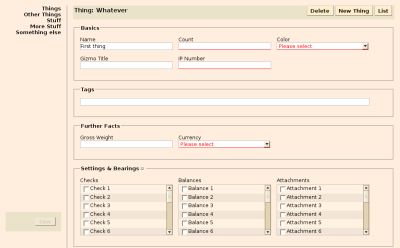
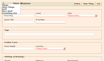
Here’s what the form example (example 1) is supposed to look like.
At 1024 x 768 pixels, the navigation links and Save button are positioned fixed in a column to the left.

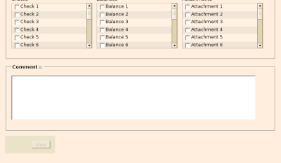
At 800 x 600 pixels, the navigation links are only shown on hover over the icon in the top-left corner; the Save button is tucked under the form itself.


What you need
Grab layout.js.
You also need Prototype.js.
What you need to do
Include the scripts in your page.
<script src="javascripts/prototype.js" type="text/javascript"></script>
<script src="javascripts/layout.js" type="text/javascript"></script>
Activate layout switching in the head of your page
<script type="text/javascript">
//<![CDATA[
Event.observe(window, 'load', function() {
  Layout.initialize({observeFontSize: true});
});
//]]>
</script>
Most likely, the default size thresholds set in layout.js won’t fit your needs. See the file itself for how to set them to different values.
(Re-)Write your stylesheets so that they make use of the size information. As an example, here’s the CSS I use for styling the navigation list on the two example pages.
#navitrigger {
  display: none;
}

#navigation {
  position: fixed;
  top: 0em;
  left: 0em;
  margin: 1em;
  padding: 0;
  text-align: right;
  z-index: 10;
}

#navigation ul {
  width: 10em;
  margin: 0;
  padding: 0;
  list-style-type: none;
}

#navigation li {
  font-weight: bold;
}

#navigation .current {
  display: block;
  width: 100%;
  color: #bbb;
  background-color: #ffecac;
}

#navigation li.admin {
  border-top: 1px solid #bbb;
}

#navigation li a {
  display: block;
  width: 100%;
}


body.small #navigation {
  position: absolute;
  text-align: left;
  z-index: 30;
}

body.small #navigation ul {
  display: none;
  background: #fff;
  border: 1px solid #888;
}

body.small #navitrigger {
  display: block;
  font-size: 150%;
  font-weight: bold;
}

body.small #navigation:hover ul {
  display: block;
}
